

2024
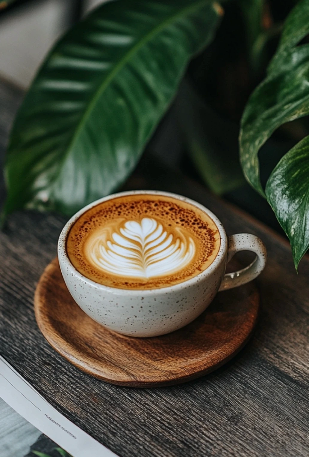
Coffee Therapy
A soulful brand identity and packaging system designed to turn a local cafe into a sensory experience. Inspired by rituals, comfort, and the simple joy of slowing down.
About
Rooted in ritual and comfort, this project redefines what a modern cafe brand can feel like.
Coffee Therapy is a café and bakery concept created to feel like a breather from the city’s noise - a space where coffee meets calm, and design sets the mood for connection. When the founders approached me, they envisioned a brand that felt less like a business, and more like a sanctuary.
A place that invites you to stay a little longer. To sip slowly. To reconnect with yourself or someone across the table. This case explores how I crafted a full brand identity that merges emotional warmth with visual clarity - from logo to packaging, signage to social media.
The Challenge
Most cafes follow trends.
Coffee Therapy needed a brand that would outlast them.
The café space was beautiful, the coffee top-quality, but the brand lacked cohesion and memorability. It was missing that feeling - the one where every element works in harmony to express who you are and why you exist. My challenge was to create a timeless visual identity that could evolve with the café’s growth, without losing the intimacy and charm that made it special in the first place. From takeaway cups to signage and print menus, every touchpoint had to evoke a sense of calm, familiarity, and thoughtful design
Solution
I crafted a complete visual identity that envelops guests in quiet elegance - a brand that feels like a slow morning, warm cup in hand, and space to simply be.
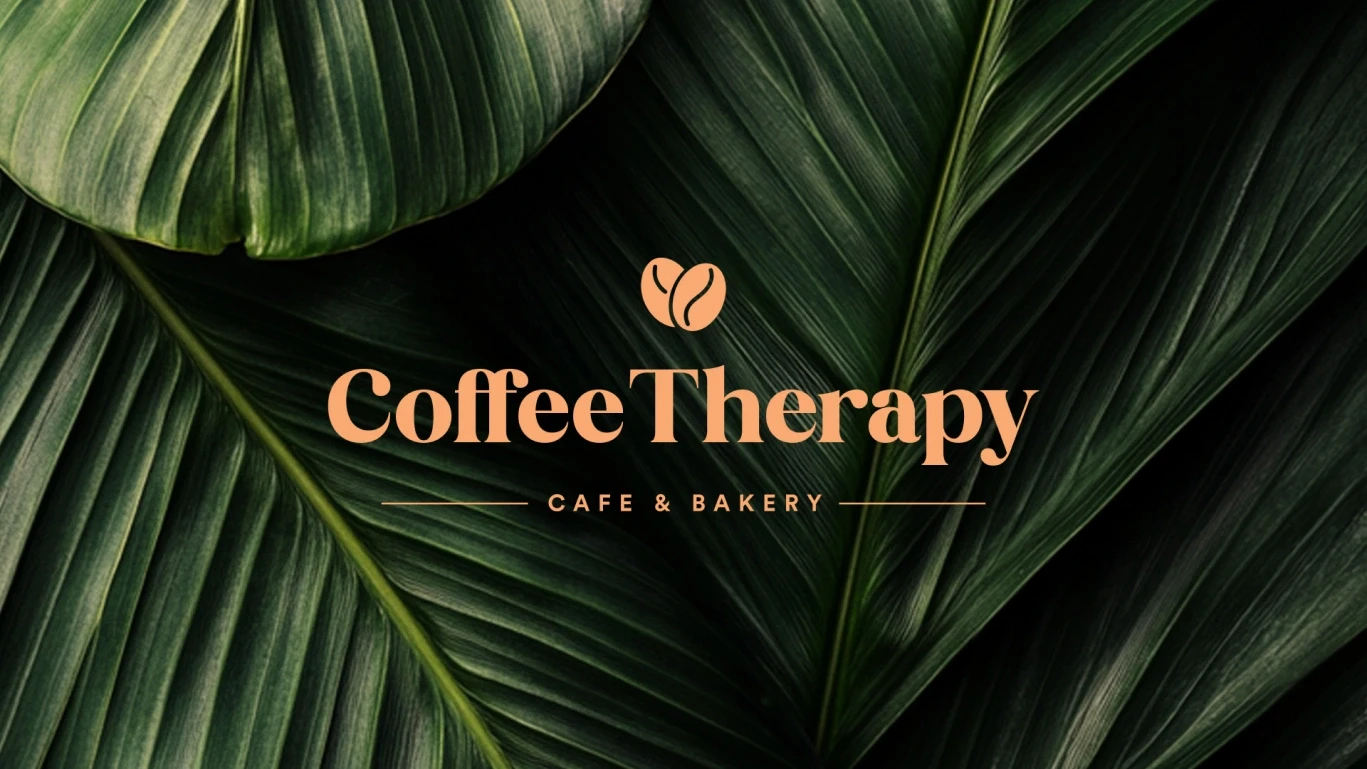
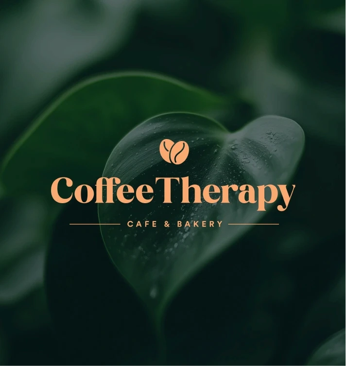
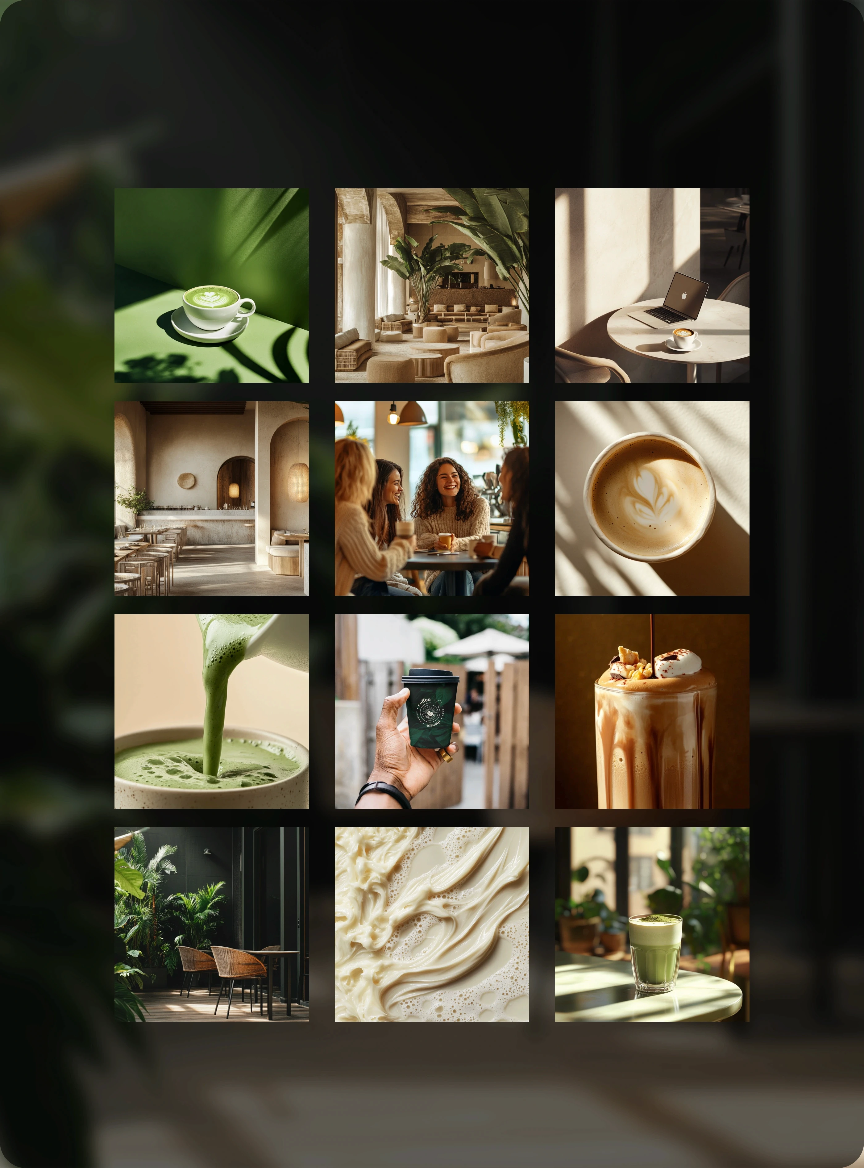
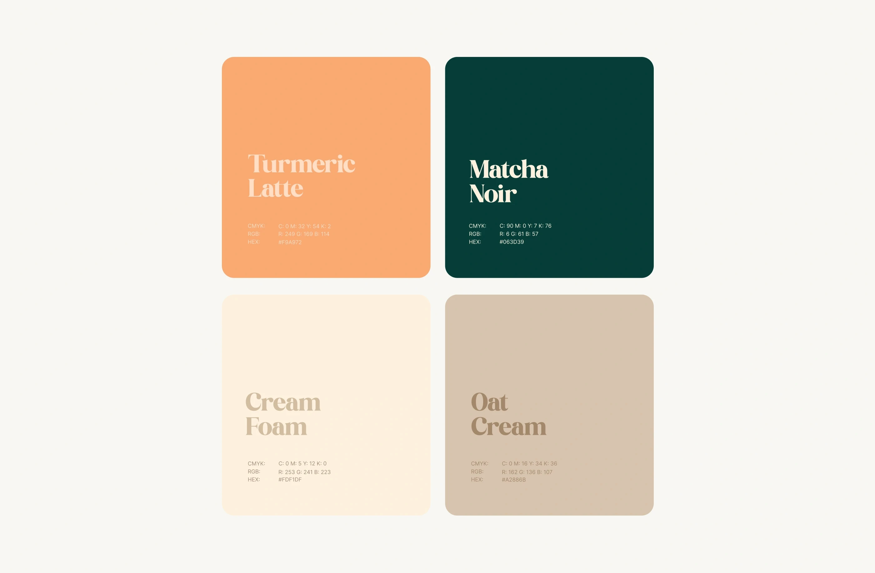
Starting with the name and brand ethos, I built a system anchored in the idea of coffee as a gentle ritual - a moment of therapy in the everyday. The design language draws from earthy palettes, botanical textures, and soft geometric forms to evoke a space that feels nostalgic yet modern.
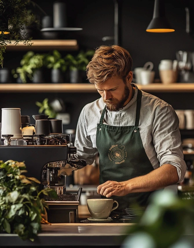
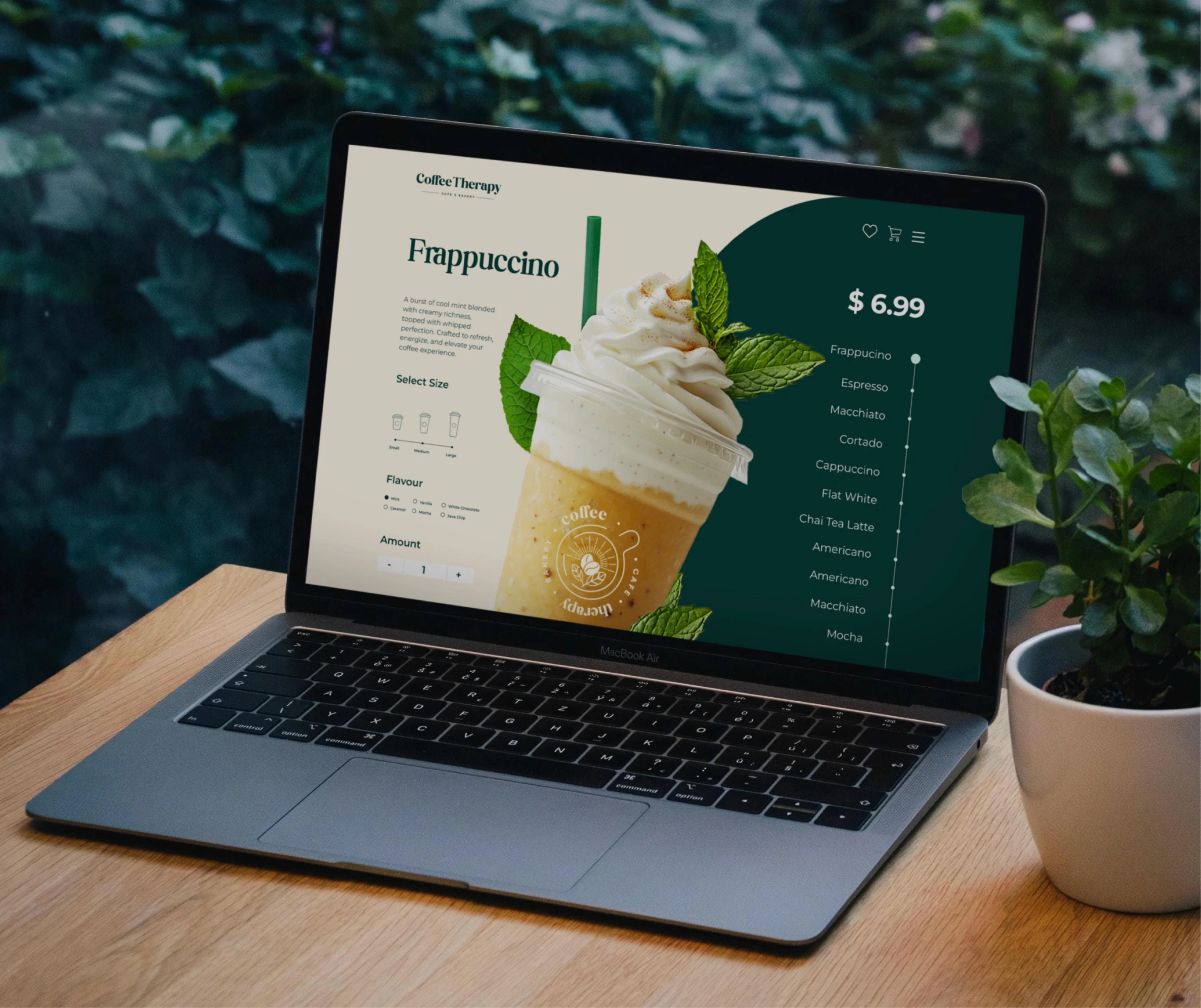
Each element was crafted not just to be seen, but to be felt - from the tactile packaging to the calming visual rhythm across print and digital. Whether it’s a loyalty card, a takeaway sleeve, or an Instagram post, the brand carries a consistent emotional thread: comforting, personal, and quietly memorable.
Key Deliverables:
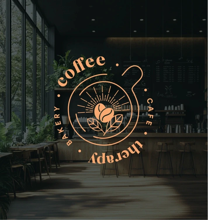
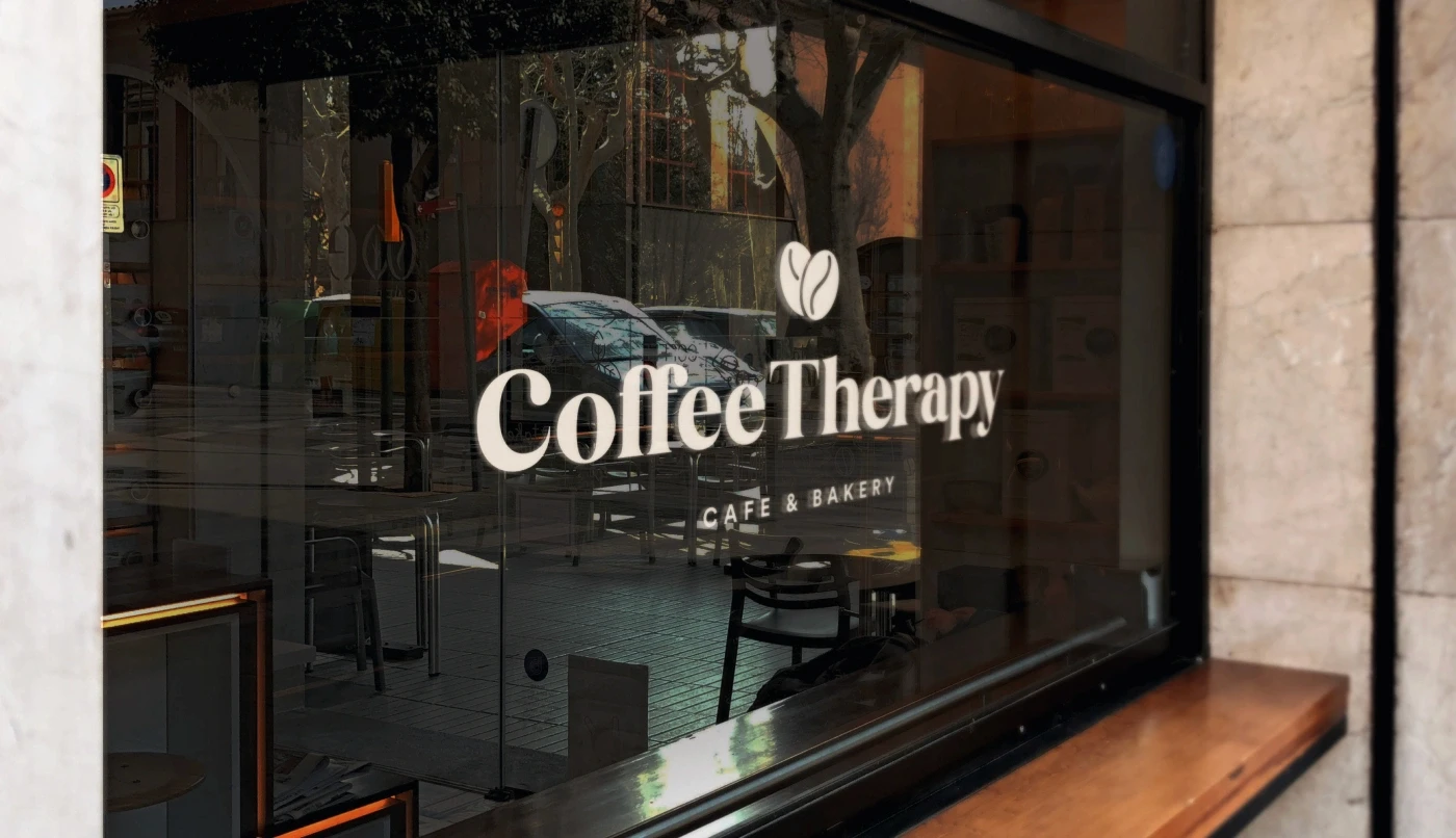
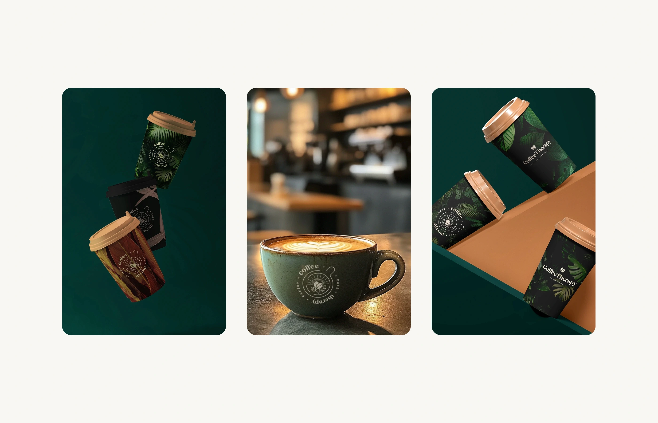
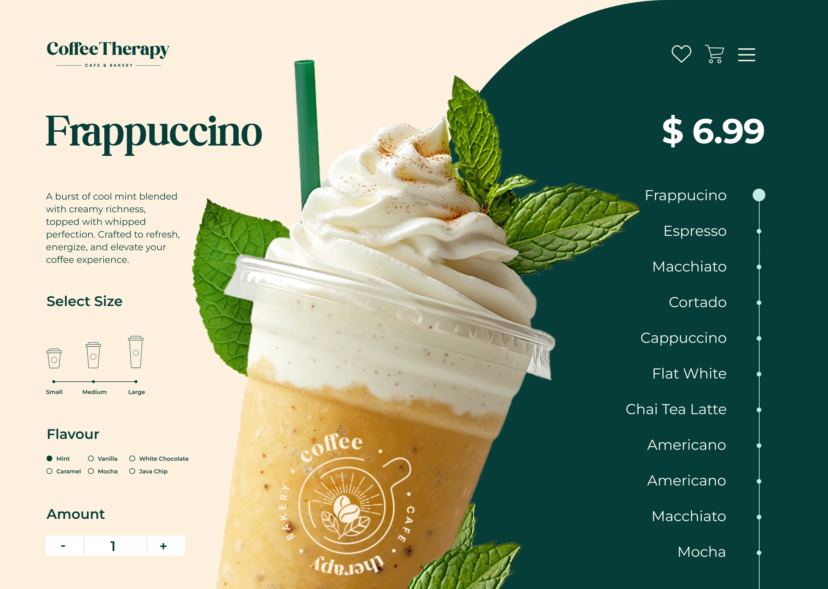
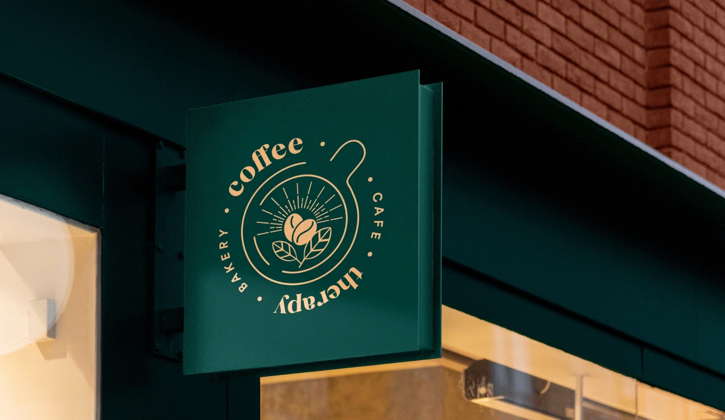
Visual Identity: Logo system, coffee bean iconography, custom typography, and nature-inspired color palette
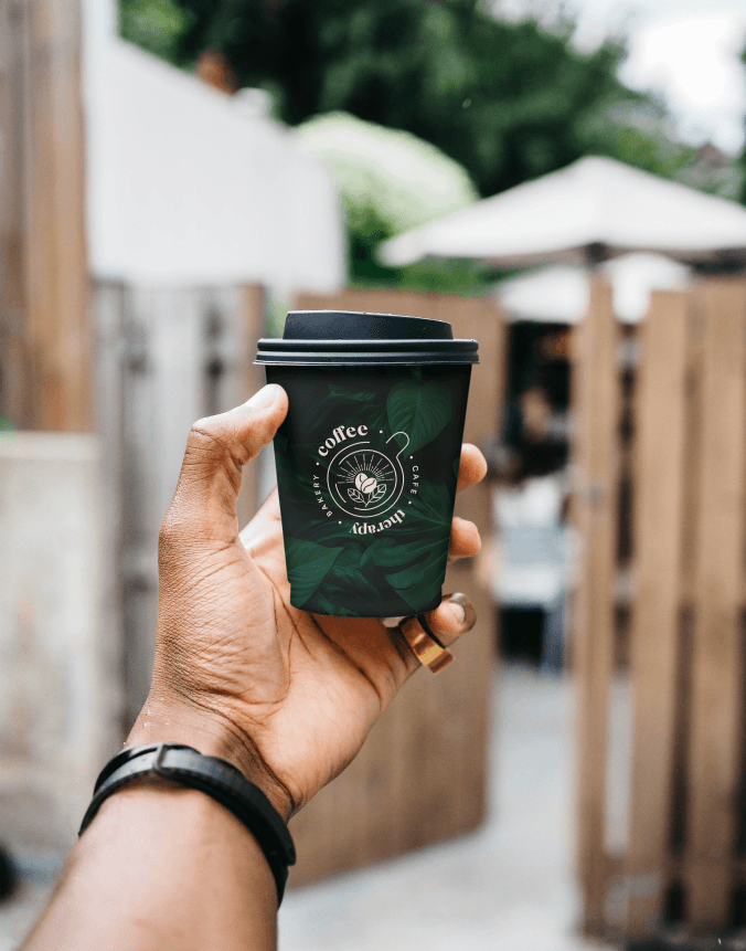
Packaging Design: Branded paper cups, takeaway sleeves, stickers, and bakery packaging
Print Collateral: Signage, window decals, takeaway menu, loyalty cards
Social Media Assets: Post templates, launch content, and mood-driven visuals
The result is a brand that customers remember - not because it shouts, but because it gently lingers.
Concept
From beans to brand - every detail was designed to be felt, not just seen.
Coffee Therapy stands for more than just coffee. It’s about presence. Pause. Ritual. The brand had to mirror that - not through loud design trends, but through considered visual language that speaks softly and resonates deeply.
The logo and coffee bean motif act as a visual shorthand for care, warmth, and craft. Supporting illustrations and natural textures bring the brand to life across every touchpoint - creating an experience that feels as good as it tastes.
More Works
(TT® — 02)
©2024


FAQ
01
How does the subscription workflow work?
02
How many tasks can I submit?
03
How fast are turnaround times?
04
Can I pause or cancel my subscription?
05
Is production (photo/video) included?
06
Do you offer post-production editing?
07
Can I request everything - branding, web, social, etc.?
08
What tools do I need to collaborate?
09
Do I own the files you create?
10
Can I use the subscription for a one-off project?
2024
Coffee Therapy
A soulful brand identity and packaging system designed to turn a local cafe into a sensory experience. Inspired by rituals, comfort, and the simple joy of slowing down.
About
Rooted in ritual and comfort, this project redefines what a modern cafe brand can feel like.
Coffee Therapy is a café and bakery concept created to feel like a breather from the city’s noise - a space where coffee meets calm, and design sets the mood for connection. When the founders approached me, they envisioned a brand that felt less like a business, and more like a sanctuary.
A place that invites you to stay a little longer. To sip slowly. To reconnect with yourself or someone across the table. This case explores how I crafted a full brand identity that merges emotional warmth with visual clarity - from logo to packaging, signage to social media.
The Challenge
Most cafes follow trends.
Coffee Therapy needed a brand that would outlast them.
The café space was beautiful, the coffee top-quality, but the brand lacked cohesion and memorability. It was missing that feeling - the one where every element works in harmony to express who you are and why you exist. My challenge was to create a timeless visual identity that could evolve with the café’s growth, without losing the intimacy and charm that made it special in the first place. From takeaway cups to signage and print menus, every touchpoint had to evoke a sense of calm, familiarity, and thoughtful design
Solution
I crafted a complete visual identity that envelops guests in quiet elegance - a brand that feels like a slow morning, warm cup in hand, and space to simply be.
Starting with the name and brand ethos, I built a system anchored in the idea of coffee as a gentle ritual - a moment of therapy in the everyday. The design language draws from earthy palettes, botanical textures, and soft geometric forms to evoke a space that feels nostalgic yet modern.
Each element was crafted not just to be seen, but to be felt - from the tactile packaging to the calming visual rhythm across print and digital. Whether it’s a loyalty card, a takeaway sleeve, or an Instagram post, the brand carries a consistent emotional thread: comforting, personal, and quietly memorable.
Key Deliverables:
Visual Identity: Logo system, coffee bean iconography, custom typography, and nature-inspired color palette
Packaging Design: Branded paper cups, takeaway sleeves, stickers, and bakery packaging
Print Collateral: Signage, window decals, takeaway menu, loyalty cards
Social Media Assets: Post templates, launch content, and mood-driven visuals
The result is a brand that customers remember - not because it shouts, but because it gently lingers.
Concept
From beans to brand - every detail was designed to be felt, not just seen.
Coffee Therapy stands for more than just coffee. It’s about presence. Pause. Ritual. The brand had to mirror that - not through loud design trends, but through considered visual language that speaks softly and resonates deeply.
The logo and coffee bean motif act as a visual shorthand for care, warmth, and craft. Supporting illustrations and natural textures bring the brand to life across every touchpoint - creating an experience that feels as good as it tastes.

More Works
(TT® — 02)
©2024

FAQ
01
How does the subscription workflow work?
02
How many tasks can I submit?
03
How fast are turnaround times?
04
Can I pause or cancel my subscription?
05
Is production (photo/video) included?
06
Do you offer post-production editing?
07
Can I request everything - branding, web, social, etc.?
08
What tools do I need to collaborate?
09
Do I own the files you create?
10
Can I use the subscription for a one-off project?
2024
Coffee Therapy
A soulful brand identity and packaging system designed to turn a local cafe into a sensory experience. Inspired by rituals, comfort, and the simple joy of slowing down.
About
Rooted in ritual and comfort, this project redefines what a modern cafe brand can feel like.
Coffee Therapy is a café and bakery concept created to feel like a breather from the city’s noise - a space where coffee meets calm, and design sets the mood for connection. When the founders approached me, they envisioned a brand that felt less like a business, and more like a sanctuary.
A place that invites you to stay a little longer. To sip slowly. To reconnect with yourself or someone across the table. This case explores how I crafted a full brand identity that merges emotional warmth with visual clarity - from logo to packaging, signage to social media.
The Challenge
Most cafes follow trends.
Coffee Therapy needed a brand that would outlast them.
The café space was beautiful, the coffee top-quality, but the brand lacked cohesion and memorability. It was missing that feeling - the one where every element works in harmony to express who you are and why you exist. My challenge was to create a timeless visual identity that could evolve with the café’s growth, without losing the intimacy and charm that made it special in the first place. From takeaway cups to signage and print menus, every touchpoint had to evoke a sense of calm, familiarity, and thoughtful design
Solution
I crafted a complete visual identity that envelops guests in quiet elegance - a brand that feels like a slow morning, warm cup in hand, and space to simply be.
Starting with the name and brand ethos, I built a system anchored in the idea of coffee as a gentle ritual - a moment of therapy in the everyday. The design language draws from earthy palettes, botanical textures, and soft geometric forms to evoke a space that feels nostalgic yet modern.
Each element was crafted not just to be seen, but to be felt - from the tactile packaging to the calming visual rhythm across print and digital. Whether it’s a loyalty card, a takeaway sleeve, or an Instagram post, the brand carries a consistent emotional thread: comforting, personal, and quietly memorable.
Key Deliverables:
Visual Identity: Logo system, coffee bean iconography, custom typography, and nature-inspired color palette
Packaging Design: Branded paper cups, takeaway sleeves, stickers, and bakery packaging
Print Collateral: Signage, window decals, takeaway menu, loyalty cards
Social Media Assets: Post templates, launch content, and mood-driven visuals
The result is a brand that customers remember - not because it shouts, but because it gently lingers.
Concept
From beans to brand - every detail was designed to be felt, not just seen.
Coffee Therapy stands for more than just coffee. It’s about presence. Pause. Ritual. The brand had to mirror that - not through loud design trends, but through considered visual language that speaks softly and resonates deeply.
The logo and coffee bean motif act as a visual shorthand for care, warmth, and craft. Supporting illustrations and natural textures bring the brand to life across every touchpoint - creating an experience that feels as good as it tastes.
More Works
©2024
FAQ
How does the subscription workflow work?
How many tasks can I submit?
How fast are turnaround times?
Can I pause or cancel my subscription?
Is production (photo/video) included?
Do you offer post-production editing?
Can I request everything - branding, web, social, etc.?
What tools do I need to collaborate?
Do I own the files you create?
Can I use the subscription for a one-off project?