
2025
Moonlight Rebelion
A digital movement rooted in softness, rebellion, and feminine duality.
About
Moonlight Rebellion is a conceptual movement and editorial blog exploring the tension between softness and strength.
It speaks to women who refuse to choose between elegance and edge - those who can be ethereal and powerful at once.
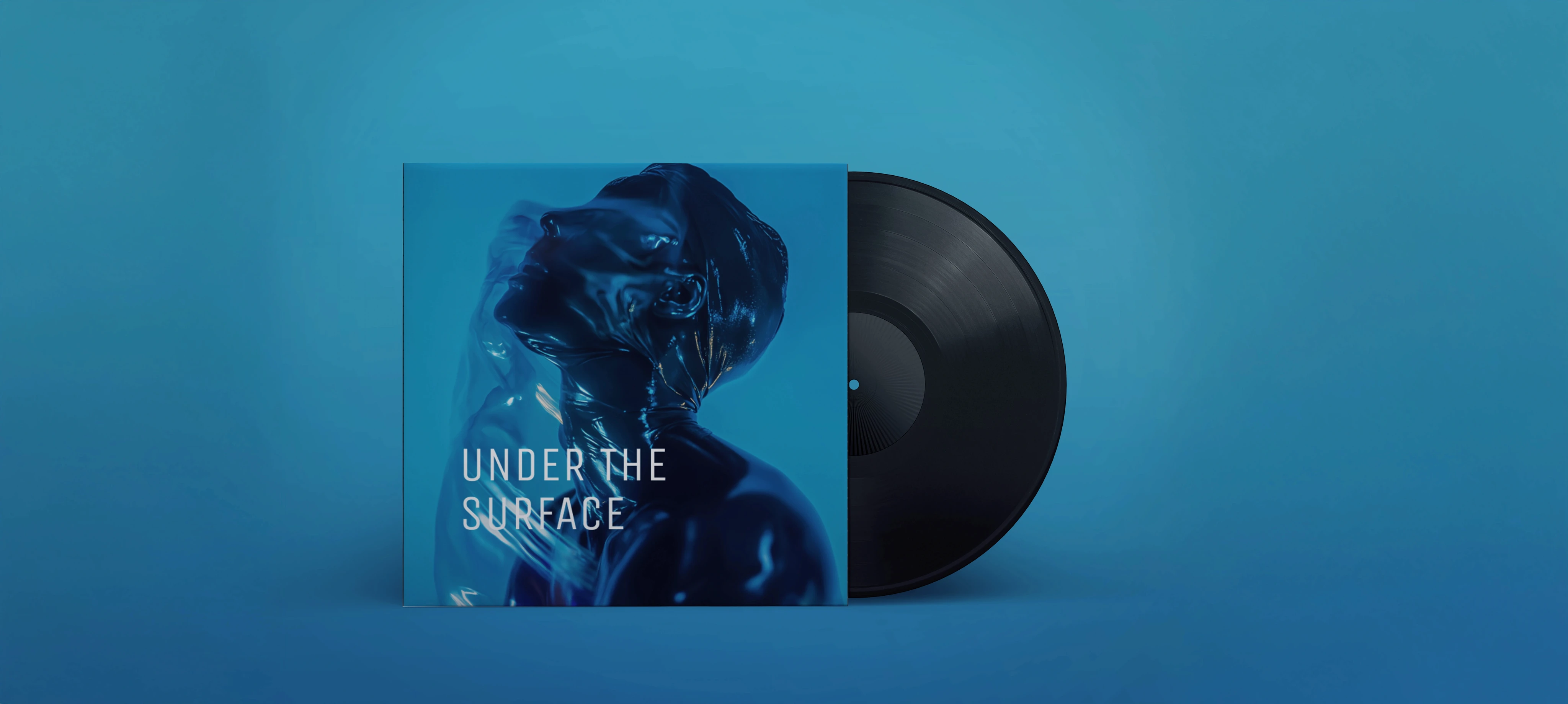
The brand was designed as a visual manifesto. A space where midnight blue meets desert warmth, where silence carries power, and where rebellion is expressed through refinement - not noise.
This project focused on building a distinctive visual identity for a movement-driven blog that feels cinematic, emotional, and unapologetically feminine.


The Challenge
How do you design rebellion without aggression?
Most brands that position themselves as “bold” lean into harsh contrast, heavy typography, or loud visual statements. But Moonlight Rebellion required something more nuanced.
The challenge was to:
Capture duality - softness and defiance in one system
Avoid cliché “feminine empowerment” aesthetics
Create a blog identity that feels like a movement, not just a content platform
Build a flexible visual language for editorial storytelling, digital use, and social presence
The identity needed depth. Mystery. Control.

Solution
The Solution
The moon icon becomes the core metaphor - fullness and shadow coexisting. It represents cyclical growth, intuition, and quiet power. The serif typography adds sophistication, while the handwritten script introduces intimacy and personal voice - reinforcing the blog’s reflective nature.
The logotype balances structure and fluidity - rebellion, but disciplined.


The Color Story
The palette is deliberate:
Mystic Midnight - depth, introspection, authority
Ethereal Sand - softness, femininity, warmth
Rebel Blaze - fire, defiance, movement
Verdant Whisper - grounding, renewal
This contrast-driven palette allows the brand to shift between poetic editorial content and bold thought-leadership pieces without losing cohesion.


More Works
(TT® — 02)
©2024

FAQ
01
How does the subscription workflow work?
02
How many tasks can I submit?
03
How fast are turnaround times?
04
Can I pause or cancel my subscription?
05
Is production (photo/video) included?
06
Do you offer post-production editing?
07
Can I request everything - branding, web, social, etc.?
08
What tools do I need to collaborate?
09
Do I own the files you create?
10
Can I use the subscription for a one-off project?
2025
Moonlight Rebelion
A digital movement rooted in softness, rebellion, and feminine duality.
About
Moonlight Rebellion is a conceptual movement and editorial blog exploring the tension between softness and strength.
It speaks to women who refuse to choose between elegance and edge - those who can be ethereal and powerful at once.
The brand was designed as a visual manifesto. A space where midnight blue meets desert warmth, where silence carries power, and where rebellion is expressed through refinement - not noise.
This project focused on building a distinctive visual identity for a movement-driven blog that feels cinematic, emotional, and unapologetically feminine.
The Challenge
How do you design rebellion without aggression?
Most brands that position themselves as “bold” lean into harsh contrast, heavy typography, or loud visual statements. But Moonlight Rebellion required something more nuanced.
The challenge was to:
Capture duality - softness and defiance in one system
Avoid cliché “feminine empowerment” aesthetics
Create a blog identity that feels like a movement, not just a content platform
Build a flexible visual language for editorial storytelling, digital use, and social presence
The identity needed depth. Mystery. Control.
Solution
The Solution
The moon icon becomes the core metaphor - fullness and shadow coexisting. It represents cyclical growth, intuition, and quiet power. The serif typography adds sophistication, while the handwritten script introduces intimacy and personal voice - reinforcing the blog’s reflective nature.
The logotype balances structure and fluidity - rebellion, but disciplined.
The Color Story
The palette is deliberate:
Mystic Midnight - depth, introspection, authority
Ethereal Sand - softness, femininity, warmth
Rebel Blaze - fire, defiance, movement
Verdant Whisper - grounding, renewal
This contrast-driven palette allows the brand to shift between poetic editorial content and bold thought-leadership pieces without losing cohesion.
More Works
(TT® — 02)
©2024
FAQ
01
How does the subscription workflow work?
02
How many tasks can I submit?
03
How fast are turnaround times?
04
Can I pause or cancel my subscription?
05
Is production (photo/video) included?
06
Do you offer post-production editing?
07
Can I request everything - branding, web, social, etc.?
08
What tools do I need to collaborate?
09
Do I own the files you create?
10
Can I use the subscription for a one-off project?
2025
Moonlight Rebelion
A digital movement rooted in softness, rebellion, and feminine duality.
About
Moonlight Rebellion is a conceptual movement and editorial blog exploring the tension between softness and strength.
It speaks to women who refuse to choose between elegance and edge - those who can be ethereal and powerful at once.
The brand was designed as a visual manifesto. A space where midnight blue meets desert warmth, where silence carries power, and where rebellion is expressed through refinement - not noise.
This project focused on building a distinctive visual identity for a movement-driven blog that feels cinematic, emotional, and unapologetically feminine.
The Challenge
How do you design rebellion without aggression?
Most brands that position themselves as “bold” lean into harsh contrast, heavy typography, or loud visual statements. But Moonlight Rebellion required something more nuanced.
The challenge was to:
Capture duality - softness and defiance in one system
Avoid cliché “feminine empowerment” aesthetics
Create a blog identity that feels like a movement, not just a content platform
Build a flexible visual language for editorial storytelling, digital use, and social presence
The identity needed depth. Mystery. Control.
Solution
The Solution
The moon icon becomes the core metaphor - fullness and shadow coexisting. It represents cyclical growth, intuition, and quiet power. The serif typography adds sophistication, while the handwritten script introduces intimacy and personal voice - reinforcing the blog’s reflective nature.
The logotype balances structure and fluidity - rebellion, but disciplined.
The Color Story
The palette is deliberate:
Mystic Midnight - depth, introspection, authority
Ethereal Sand - softness, femininity, warmth
Rebel Blaze - fire, defiance, movement
Verdant Whisper - grounding, renewal
This contrast-driven palette allows the brand to shift between poetic editorial content and bold thought-leadership pieces without losing cohesion.
More Works
©2024
FAQ
How does the subscription workflow work?
How many tasks can I submit?
How fast are turnaround times?
Can I pause or cancel my subscription?
Is production (photo/video) included?
Do you offer post-production editing?
Can I request everything - branding, web, social, etc.?
What tools do I need to collaborate?
Do I own the files you create?
Can I use the subscription for a one-off project?